How to Perfect your Event Landing Page
Consider your event landing page just a big ass call-to-action. To be most effective, your event landing page does two things–brands and markets your event and turns site visitors into attendees. I’ve figured out the most useful strategies on How to Perfect your Event Landing Page and sell out your next event.
Be Consistent
Everything about your event is built on the trust you’ve built with your audience. If they know you as the lady with a pink and gold logo, now’s not the time to throw a lime green headline their way! Stay consistent throughout the entirety of your event marketing outreach.
Relatability
Just as they’ve gotten to know you, show your potential attendees you know them by highlighting what they’ll enjoy more from your event. Your event landing page makes a HUGE impression and your audience needs to connect with it. Emotional relatability not only seals the signup deal but it can be the beginning of a long-term attendee commitment. How will you propose?
Options
No one walks into a nail salon knowing exactly the color they want. After spending at least 15 minutes scanning the shelves, that perfect blush pink swoops in to steal your heart. That’s exactly what your call-to-action and signup need to be on your event landing page. People need options and you never know at which point in page your potential guest will be inspired. Have at least 3 (even up to 6) opportunities for registration, receiving more info, and signup. Perfecting your event landing page will require choices.
Be Direct
Your event landing page is not a place to tell the entire story of your brand. Get rid of the fluff and focus on the good stuff and highlight it. Every bit of information on your event landing page needs to be simplified, refined, and direct. I always start my Event Landing page with the name of the title, followed by a subheader that can either ask a question.
For example, “Are you looking for a high vibe experience that will bring your online business to the next level?”
OR make a statement: Bring your online business to the next level with this high vibe event experience.
Confusion doesn’t convert. The anatomy of a solid event landing page is much like our own-many parts but all serve a function.
Make everything easy to navigate, understand, and no distractions. Details of your event should be evident almost immediately, especially the date, time, location. The rest you can have a little more fun with.
Lead with a Bold Design
Imagery and visuals are everything. Skimping out on a well-designed logo or brand will have site visitors high-tailing it. Don’t lose them on the first click!
Limit text. Reaching an event landing page and being met with hundreds or thousands of words is a conversion nightmare. Opt for a few words that represent the brand and the purpose of the event. There are a thousand ways to say the same thing. Try to pick “power” words and toss the rest.
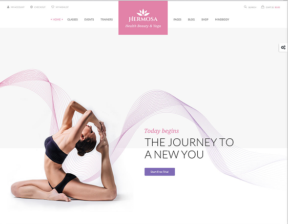
[media-credit name=”Hermosa | Health Beauty + Yoga” align=”aligncenter” width=”562″] [/media-credit]
Here’s an example of the Hermosa Health, Beauty, and Yoga Conference. Clean, clear design and they chose their texts wisely. Keeping it short and to the point, while still representing the purpose of the event.
More than words, images are telling. Using shots that represent the best parts of your event so people can’t resist the signup button. Everyone loves a first-look at what’s to be expected and what to get excited about.
Focus on your Unique Value Proposition
The whole idea of creating a landing page is to persuade visitors to attend your event, right? So, what makes you unique? Why you and not others? Ensure that it shouts out clearly why one should choose you. Think about things that people don’t find easily elsewhere. Include things like competitions with attractive prizes, reunions, world-renowned speakers, lifetime deals, opportunities, and experiences. Of course, offering only what you can deliver.
It’s all about the benefits, baby. Your UVP is all about what attendees will get from your event that they can’t get anywhere else.
Utilize Social Sharing Buttons
Everyone loves a good ol’ sales funnel! Usually beginning with a solid event landing page the sales funnel will continue to trickle down through other channels. Provide page visitors every opportunity to be WOWed by your upcoming event by sharing your social media plugs.
While you’re at it, clearly display the event’s unique hashtag to ensure that your followers have a chance to engage. Sharing your other platforms supports your brand and provides proof! Being the social animals we are, make sure you can lure attendees with yummy bait.
Mobile-Optimization
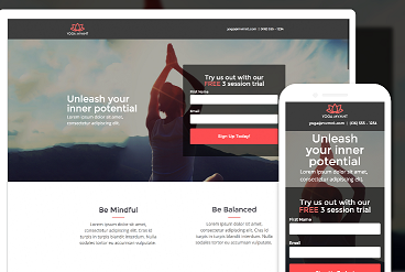
[media-credit id=6 align=”alignleft” width=”368″] [/media-credit]
There’s a 50% chance someones come to your event landing page on their mobile device. Make sure your landing page is mobile ready in format and layout. Wouldn’t want your hard work to look jumbled or clunky!
Video/Slideshow
Movement on a landing page is just freakin cool. And in most cases, it works at exciting people. Have a video on autoplay with event-appropriate music.
Mud run does a good job at exciting competitors about their upcoming event by playing a video of previous races and house music. They never fail to highlight a slow-mo of a race plunging face first into mud. Hey, whatever works!
Close your Deal with a Powerful Sign up Form
Registration has to be painless and easy to navigate…maybe even a little in your face. Afterall the entire purpose is to have them register for your event you better give them the opportunity to do so!
Use fun font and colors on a “Register Here” or “Sign Up”. Exclusive deals for “early” registration don’t hurt to put a little emphasis on your call-to-action. Just place the offer in close proximity to a place readily available for email address input.
The reality is, as long as your event landing page is obvious and speaks directly to your target audience, all of these steps should align and can result in capturing leads and increasing your conversion rates.


